Scanatron
A handheld toy that allows children to turn colors around them into music.
🔒
Project Info
Date
2022
Client
Student Project
Hats Worn
Product Design
Graphic Design
Packaging Design
Physical Product Design
Video Editing
Awards
Rookie Awards - x3
Indigo Design Awards - x20
Brief
"Conceptualize and design a childrens toy with minimal screens, and then create a fully working prototype". Our team did just that, creating a way for children to turn colors into music.
Solution
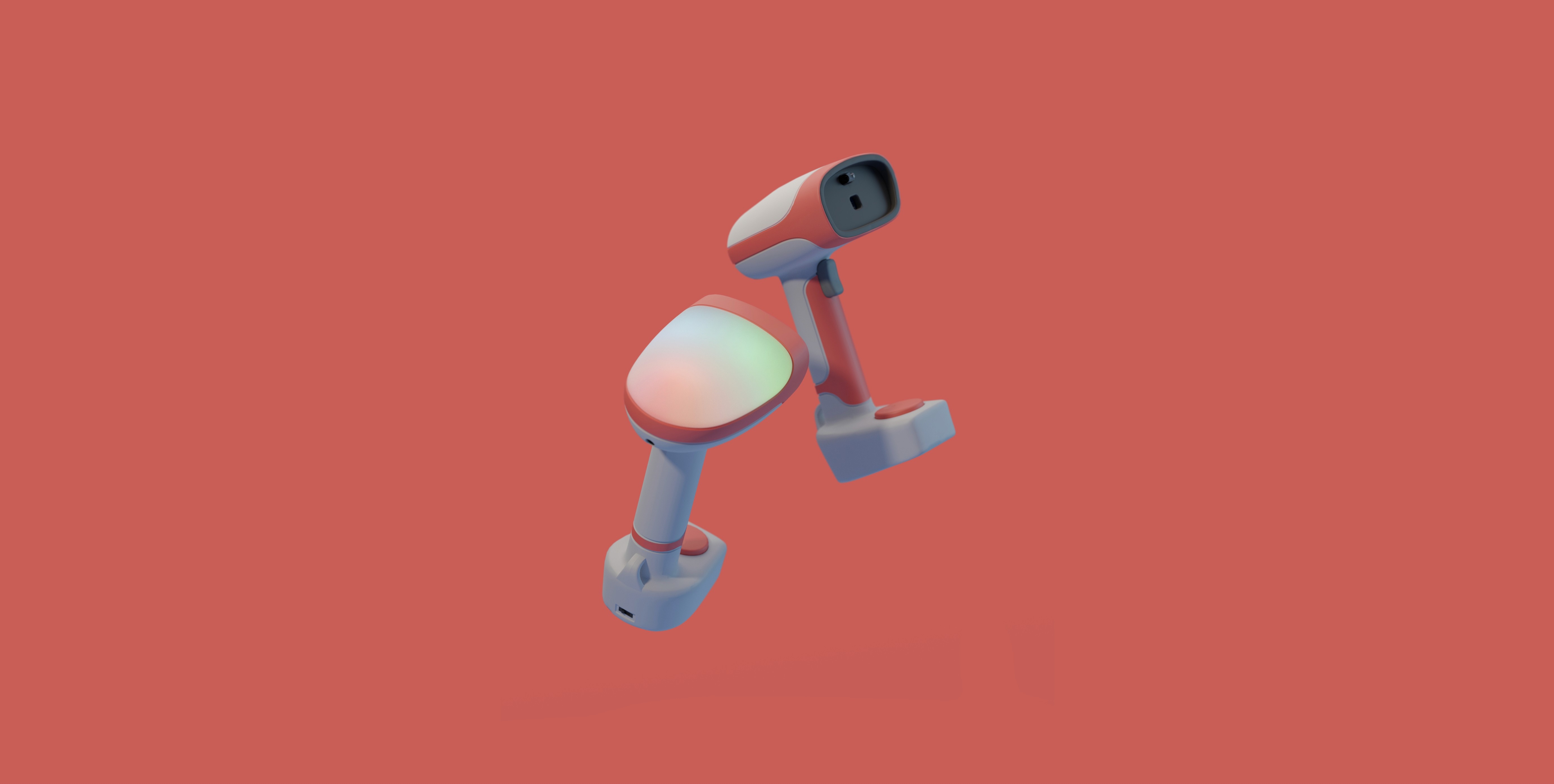
Kids love music, and just being able to make noise. From banging pots and pans, to dinking around on a keyboard, they want to be able to have fun while making unique sounds. Unfortunately, it's hard for them to truly express themselves without extensive music theory knowledge. Enter, Scanatron! A handheld scanning device that allows kids to scan colors from their day-to-day life into music - automatically!
My role for our team of 3 was Visual Lead. I created all of our packaging/onboarding experience for our toy, 3D printed and painted our physical form, assisted in the coding process, and even created a marketing motion media video.
Research
Because this was an introduction to physical computing class, we didn't really follow a traditional UX timeline. During our brief research, however, we did pull out the desire for children to make music - without the need for music theory or extensive knowledge. We designed around our self-generated prompt: how might we inspire creativity through unique interactions with music, without the need for music theory knowledge? We created 3 goals for ourselves to measure success:
Use tech to facilitate creative, musical interactions.
A toy that will keep a child engaged and excited.
Output sounds sonically pleasing.
We also ran some quick user tests, finding out the following:
Understand of what type of button/switch people prefer for a scanner-type toy (i.e. a trigger and push button) and what shape they think is the best to fit the form.
Ask people to recall and define what rhythm, melody, and harmony.
Identify if users have a color association with rhythm, melody, and harmony.
From these tests, we found out 2 important results:
With the various responses, the most common combination is RGB where rhythm is red, melody is green, and harmony is blue.
When asked about these musical terms, people with various levels of music education struggled to recall and give a definition, so we needed to created a toy that removes the fiction of knowing about music and make it fun.
Building It
Physical Development
Due to our research, we decided we wanted to make something portable that gives a fun, easy way to make music. After many sketches and a couple coffees, we decided on a a device that scans colors (red, green, blue) that would play different pieces of music depending what color was scanned.
After landing on a form factor and interaction, we developed a sketch into a 3D model in Rhino, which was then 3D printed and painstakingly sanded and painted. This was paired with a nest of of Arduino wiring, resulting in a fully working prototype! Included was a knob for volume, and a headphone jack to keep the parents happy.
Branding
To contrast with the futuristic nature of this product, we developed a more retro-feeling branding identity.
A food-related character was developed to represent each color/musical component - Rhythmberry representing Rhythm, Melondy representing Melody, and Harmonpea representing Harmony.
But why food-y characters? We wanted to make an exciting unboxing and onboarding experience.
We packaged everything in a big cereal box to invoke the memory of finding a toy in your cereal, just a little reversed in this instance. To keep with the metaphor, we also created 3 snacks that would come in the cereal box, whose packaging would also serve as the onboarding and explanation on how to use Scanatron.
Takeaways
It was so valuable and refreshing to be able to break out of a strict design process and just follow gut instincts. From a weird visual identity to such a fun concept and product, this project reminded me how design can be truly fun again and that it's okay to not take yourself super seriously while still producing award winning work.